•In
all three of these contents pages they have
title at the top which conventionally states the name of the magazine
and says ‘Contents’. The NME contents page differs from the other two contents
pages as it doesn’t say ‘Contents’ it says ‘This Week’ instead. This indicates
that NME is weekly and will feature fairly recent news to do with the music
industry. They all have the date of the issue with the title.
 •They
all have a list of the features in the magazine partnered with a page number
that gives reference to the location of the article, usually with the name of
the article. This list is conventionally on the right side of the page but the
for the Q magazine contents page it is different since it is on the left side
of the page. The list is split up into sections which categorise what the
articles will be about usually headed by upper case bold text, for example,
‘News’ or ‘Reviews’.
•They
all have a list of the features in the magazine partnered with a page number
that gives reference to the location of the article, usually with the name of
the article. This list is conventionally on the right side of the page but the
for the Q magazine contents page it is different since it is on the left side
of the page. The list is split up into sections which categorise what the
articles will be about usually headed by upper case bold text, for example,
‘News’ or ‘Reviews’.
•All
of the text is usually in upper case font so it is clear for any of the
audience to read and understand. The text is usually only lower case if it is
either a quote from an article, an extract from a story or the letter from the
editor.
 •Usually
in contents pages there is a letter from the editor which is demonstrated in Kerrang
magazine which talks about what he/she has been up to since the last issue and
usually summarises the contents of the magazine in an informal manner. Q and
NME don’t have this conventional letter from the editor. If the magazine has a letter from the editor this could reflect the relationship between the editor and the readers, and shows how the magazine has a particular audience and wants to satisfy their needs.
•Usually
in contents pages there is a letter from the editor which is demonstrated in Kerrang
magazine which talks about what he/she has been up to since the last issue and
usually summarises the contents of the magazine in an informal manner. Q and
NME don’t have this conventional letter from the editor. If the magazine has a letter from the editor this could reflect the relationship between the editor and the readers, and shows how the magazine has a particular audience and wants to satisfy their needs.
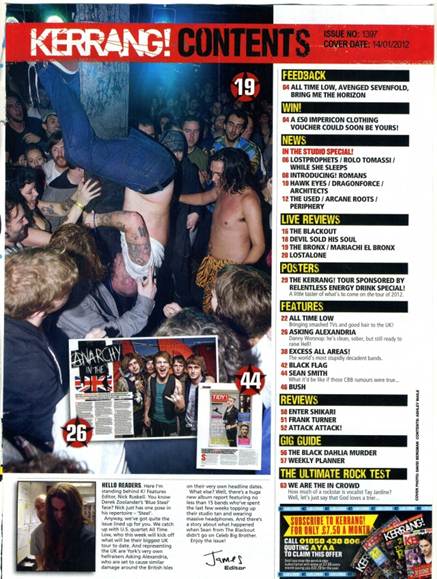
•A
main feature that dominates the content page is the main image which usually
links to an article in the magazine which the editor may have thought would
attract the reader’s interests. These three contents pages only have either one
main image and either one or two other smaller images. For Kerrang's contents page the main image is of a mosh pit which connotes the careless rebellious attitudes of the magazine in particular and shows how Kerrang's fans get so into the rock music and love to enjoy it by taking part in mosh pits.The main image for Q's contents page is of the band, The Courteeners in a countryside setting. This connotes that the band are quite relaxed and laidback and as they are in a natural setting it shows that they aren't a fake band. This could also relate to the magazine showing it's classic and simplistic attitudes.
•Each
of these contents pages have a continuous colour scheme which tends to reflect
the particular genre of the magazine, in this case all of these contents pages
are about either alternative or a mixed range of music. Therefore, the colour
schemes of black and red or black red and yellow reflects the genre and the
magazine’s bold, loud ideology.