Wednesday 19 December 2012

Front Cover:- Second Draft


With this draft I have made a few changes to experiment with my ideas. The cover lines are no longer interfering with the main image and I have changed the colour of the text to fit in with an overall colour scheme. I chose the orange colour background to link with the name of the magazine 'Ash', this makes the cover look bold and makes the cover stand out. However, the amount of empty orange space on the cover makes it seem not as interesting as I would have hoped it to be. For my next draft I will take more pictures to fill more of the space and make it look full of articles and features to read about. If the cover doesn't look as if it contains a lot of articles and interesting features to read then people are less likely to buy it. This draft still has all the conventional features of a magazine but I have moved the bar code to the bottom right hand corner and moved a cover line and an image further up.

Tuesday 18 December 2012

Front Cover - first draft

This first draft shows conventional features of a magazine such as the masthead, headline and cover lines. I like the main image that I have chosen for the cover, however, the cover lines interfere with the image as they cover some of the subject's face. The colour of the cover lines make it difficult for them to be read. Therefore, for my next draft I will change this aspect by matching it more to my decided colour scheme of red, black and white. I will change the position of the cover lines so they don't interfere with the main image. I will think about experimenting with a different image and using that for another draft to see if a different angle of shot works better than this canted angle shot. I like how I have rotated the images at the bottom of the cover as it links to the text 'Reckless take on the U.S', this is because they are positioned as if they are holiday snapshots and appear to look like loose photographs. I am not too sure about the black background, so when I produce my second draft I will experiment with a different colour of background or make the colour more transparent. 

Contents Page- Conventions

 In all three of these contents pages they have  title at the top which conventionally states the name of the magazine and says ‘Contents’. The NME contents page differs from the other two contents pages as it doesn’t say ‘Contents’ it says ‘This Week’ instead. This indicates that NME is weekly and will feature fairly recent news to do with the music industry. They all have the date of the issue with the title.
      •They all have a list of the features in the magazine partnered with a page number that gives reference to the location of the article, usually with the name of the article.      This list is conventionally on the right side of the page but the for the Q magazine contents page it is different since it is on the left side of the page. The list is split up into sections which categorise what the articles will be about usually headed by upper case bold text, for example, ‘News’ or ‘Reviews’.
      •All of the text is usually in upper case font so it is clear for any of the audience to read and understand. The text is usually only lower case if it is either a quote from an article, an extract from a story or the letter from the editor.
      •Usually in contents pages there is a letter from the editor which is demonstrated in Kerrang magazine which talks about what he/she has been up to since the last issue and usually summarises the contents of the magazine in an informal manner. Q and NME don’t have this conventional letter from the editor. If the magazine has a letter from the editor this could reflect the relationship between the editor and the readers, and shows how the magazine has a particular audience and wants to satisfy their needs.
      •A main feature that dominates the content page is the main image which usually links to an article in the magazine which the editor may have thought would attract the reader’s interests. These three contents pages only have either one main image and either one or two other smaller images. For Kerrang's contents page the main image is of a mosh pit which connotes the careless rebellious attitudes of the magazine in particular and shows how Kerrang's fans get so into the rock music and love to enjoy it by taking part in mosh pits.The main image for Q's contents page is of the band, The Courteeners in a countryside setting. This connotes that the band are quite relaxed and laidback and as they are in a natural setting it shows that they aren't a fake band. This could also relate to the magazine showing it's classic and simplistic attitudes. 
      •Each of these contents pages have a continuous colour scheme which tends to reflect the particular genre of the magazine, in this case all of these contents pages are about either alternative or a mixed range of music. Therefore, the colour schemes of black and red or black red and yellow reflects the genre and the magazine’s bold, loud ideology. 


Initial layout for front cover


Monday 17 December 2012

Font ideas


Ideas for the name of my magazine


Photo shoot 1 & 2


Looking through my images from both photo shoots I have gained a selection of images from which I can select to go on my front cover, contents page and double page spread. I have taken a variety of shots with different lighting and different poses which reflect the genre and ideology of my magazine. I could use the images from the first photo shoot to talk about a solo artist and the images from the second photo shoot to talk about a double act in my magazine. I may take more photos to give myself more to choose from, preferably of a band with at least three people because they are the type of acts that I wish to focus my magazine on. I may also take more extreme close up shots since I don't have as many of these types of shots.

Sunday 25 November 2012

Mock up of front cover (borrowed images)


When producing my mock up I stuck to the conventions of a magazine by including the mast head, cover lines, headline, main image and bar code which are the elements that makes it look like a magazine. I stuck to a particular colour scheme of red, yellow and black which was to ultimately reflect the genre of the magazine - alternative/indie. In this mock up, I don't think the genre of the magazine is being shown as much as it could be, therefore in my future drafts I could include images such as musical instruments like acoustic or electric guitars, drumkits etc. On the far left of the cover, the empty space stands out as there is nothing there. In my  future drafts and for my final front cover I should make sure I fill the space completely with more conventions such as more images, cover lines, call outs or pull quotes from an interview with the model in the main image. I could also look at more fonts so I could choose one that reflected the genre of my magazine and looked appealing to the target audience.

Tuesday 13 November 2012

Focus Group

http://www.youtube.com/watch?v=qPHgQRTlpDU
http://www.youtube.com/watch?v=MK4QEN-UvPU
http://www.youtube.com/watch?v=fz-wFOAf3C8

Here are all three clips showing my focus group. By carrying out this focus group I have found out that people don't want to spend too much money on a magazine and will only buy one if it's at an affordable price. My target audience will be interested in reading the magazine if it has a bold and interesting layout and if it includes interesting features and stories, they mainly want to know about famous bands that are around at the moment and not so much of any newcomers. An interesting point that I picked up from the focus group was that people prefer it if the questions for competitions that the readers can enter are hard instead of being so obvious. This is because they think that it is a deliberate scam to make money so they get lots of entries and therefore they would be less likely to have a chance at winning any of the prizes. From the focus group I have learnt that my target audience are interested in upcoming events such as festivals and concerts, so one of the features of my magazine could be a line up for a upcoming festival etc.

Monday 5 November 2012

Music Magazine Mood Board


By looking at the mood board it is evident to me that my target audience looks up to role models in the music industry that enjoy alternative rock music and love playing to their fans. When looking at the different images the different bands are all dressed quite casually and have a unique style such as tattoos, dark or coloured hair, some men are even wearing eye makeup in these images. The expressions of all of the models' faces are very serious, some will only ever have a slight grin on their faces, this shows how all the different acts are trying to come across as cool and show off their image of being serious about their music. However, the grins on some of the models' faces shows their relaxed and laid-back nature.  In the different magazine covers they all tend to use an upper case font so it is clear and easy to read. This also makes the cover lines and headlines look bold and stand out to the audience so it draws them in and makes them interested in the different stories the issue of the magazine may feature. It is clear that the mood board is a music magazine board due to the images of CD's, guitars and a drum kit, which still reflects the genre of alternative rock. Using this mood board to help me, I will model my magazine on this selection of images and take them into consideration when taking my photos and producing the layout of my magazine cover.

Friday 2 November 2012

Uses and Gratifications Theory

During the 1960s, it became increasingly apparent to media theorists that audiences made choices about what they did when consuming texts. The Uses and Gratifications theory presents the idea that audiences are made up of individuals who actively consume texts for different reasons and in different ways, usually for their own gratification and pleasure. The theory demonstrates that the audience have the power as it is up to them whether they buy the text or not, whether it be in this case a magazine, film or television show. It is essential that the producers of a media text meet the needs of an intended audience. The consumers have wants and desires, they consume the types of chosen media for individual needs. For example, with a music magazine the producer should make sure they meet the needs of the niche audience who like that particular genre of music they are focusing on. When producing my own magazine I could do this by including artists, features and articles which are specific to the alternative genre. My target audience would gain gratification by reading a magazine which catered for their needs specifically. For example, if they read an article about a rock band's new album.

 In 1948, Lasswell suggested that media texts had four functions for individuals and society. These are: surveillance, entertainment, correlation and cultural transmission. Bulmer and Katz expanded the theory in 1974 and said there were four main reasons as to why audience may want to consume media texts. This may be for diversion, escaping from a person’s regular routine and everyday problems; personal relationships, using media for emotional interaction such as substituting soap operas for family life; personal identity, finding yourself as an individual reflected in media texts or learning behaviour and values from texts; and surveillance, finding out information which could be useful for living such as weather reports, financial news and holiday deals. My target audience in this case would use my magazine for diversion, they may feel that it helps themselves to show their individual personality by reading about alternative music and feeling like a part of a group.

An example of the Uses and Gratifications Theory which has immersed quite recently is the social networking media, Facebook in particular. The desires and needs of people who use social networking websites are socializing, entertainment, self seeking and the need to find out different information. Students are interested in talking and meeting other people to achieve a sense of community and to be able to feel a part of a group if they are talking about a topic to do with the social networking website. They find that engaging with people on these sights provide a source of entertainment and by doing so they can find out their personal status as well of those of their friends through participating in social networking.
Producing a music magazine should fulfil my target audience’s needs as they will want a magazine which informs them about music so they can talk to their friends about this topic. Readers will want to find out about the particular genre of music that they like, which in this case will be alternative rock music, this fulfils the reader as they want to find out about what their favourite rock bands are doing and any new music which is coming out.

The theory can appear to be quite simplistic and limited in relation to the complexity of how we the audience/reader actually work with a text. The theory assumes that media texts identify desired needs on behalf of the audience and provide material to gratify them. Another interpretation is that the audience creates the desired needs as a response to material provided by the media. Many of the uses and pleasures can be seen as ‘making the best’ of what material is available or being given and putting it to our use which could be different from what the producer originally intended. 

Demographics


Demographics are characteristics which can be measured of media consumers such as age, gender, race, education, income level, and interests. A business's target demographic captures a group of people at which their products/services are aimed.


 It is important to understand demographics when it comes to music magazine consumption as it needs to be aimed at a particular demographic in order to sell any copies of the magazine. People who are part of quite a scientific profession such as medicine are more likely to buy a New Scientist magazine or an issue of The Lancet than OK Magazine. Or if someone was an estate agent they are more likely to buy an issue of Property Drum than a copy of BBC Top Gear. However a person’s hobbies and interests can turn someone in a different direction when it comes to their choice of magazine. For example, if someone was interested in Golf they may buy Today’s Golfer. However, someone who liked Golf would be expected to be come from the Upper Middle Class or Middle Class demographic as it is seen as a wealthy and sophisticated person’s sport. Therefore, this would affect the price of the magazine since the editors of the magazine would expect their readers to have a large disposable income. Someone of Middle Class or Lower Middle Class is more likely to buy an issue of Empire magazine as it costs £3.99 an issue, people of this particular demographic will have higher disposable income and would be more likely to spend it on a magazine within this particular price range. Whereas someone of working class is more likely to spend around £2 for an issue of a particular magazine since they will have lower disposable income.

Demographics may affect the consumption of my magazine, since if I aimed the magazine at a particular demographic,  including things that a group of certain people may be interested in and gave it a price which someone from this particular group couldn’t afford, then no-one would buy the magazine. Kerrang magazine, which I am going to base my own magazine on is aimed at mainly students either in full time education or who have low income jobs, this is reflected in the price per issue which is £2.20. The demographic which I am going to aim my magazine at will be students who come from all sorts of backgrounds, particularly teenagers who are more in to music than adults are. Students who go to university will have most probably come from the A B or C1 demographic, but school children will have come from the full range of demographics, this makes it hard to say which demographic I am aiming the magazine at. This is why, when producing my magazine I need to keep the price to around £2 since students from all backgrounds will not have a high disposable income and would be less likely to spend over £4 on a magazine. The issues will be weekly like Kerrang and will include stories on what many people’s favourite bands are getting up to, as well as newcoming bands. Competition advertisements will give readers the chance to win tickets to see a particular band at a gig, or to win backstage passes to meet that band, or even to win band merchandise. The magazine will be sold in newsagents and chain stores such as WHSmiths since students will be looking in these shops to buy magazines. It will have around 100 pages so readers can flick through the stories and features that they are interested in and it will be fairly easy reading for them as well.

Reader profile


The majority of Kerrang’s readers are male coming between the age of 15 and 24 at 69.5%, showing that the magazine is full of youth and masculinity. However, the magazine does account for the older readers as well, 12.8% being between the age of 25 and 34 and 9.3% being between the age of 35 and 44. Kerrang’s readers being the heaviest music consumers are also active consumers of media, fashion and computer games.  On average a Kerrang reader will buy 6 albums a month, being 8 times more likely to spend £200 a year on various albums and they are 5.5 times more likely to attend a rock gig as all of Kerrang’s readers love rock music. The magazine is very young so this makes it perfect to advertise film and mobile technology since this appeals to the majority of Kerrang’s target audience. The magazine has a readership of 378,000 people and circulates 42,203 copies per issue (January-June 2012).
Jim, 22 lives and breathes rock music 24/7, he engages with music from the minute he wakes up to the minute he goes to sleep. It informs his choice of friends, leisure time, hobbies and attitudes to fashion sense and lifestyle. When he is not listening to music or watching music television, he talks to friends about the music he loves, he attends rock gigs and dreams about being a rock star. Jim, being like most other Kerrang readers is sharp and switched on, he has strong morals and is proud of his own individuality. He sets fashion trends in his peer group, but is also heavily influenced by well-known musical icons and scenes. The bands he supports he is extremely loyal to and trusts them. Jim is a reader which sums up all of Kerrang’s readers, who simply love rock music.
By looking at the reader profile of Kerrang’s readers it has helped me in planning my magazine as it has helped me come to conclusions about what my readers are like and how devoted they are to rock music. Kerrang is the magazine I am going to base my own magazine on and it will try to appeal to a broad spectrum of readers just like Kerrang does. Kerrang’s readers are interested in what their favourite bands are up to, music festivals and just listening to music, this is what should feature in the magazine that I produce. However, it should give project the message of rejoicing in individuality and being unique since this what Kerrang particularly celebrates. Kerrang’s readers are loyal to their favourite bands and are quite happy to pay money for their albums, singles and tickets to go see them play. 

Tuesday 23 October 2012

Brief

To design a front cover, contents and double page spread of a new music magazine. All images and text must be original, a minimum of four images must be used.

Monday 22 October 2012

LIIAR Analysis of front cover, contents page and double page spread


Kerrang
Kerrang magazine are published by Bauer Media group who have also published magazines like Q magazine which is also a magazine which targets people who listen to alternative music. Bauer publish 38 million titles a week and operates in 15 countries worldwide, it is well established since it was founded in 1875 and started out as a small printing house which has grown into a worldwide publishing and media company. The group has always been managed and privately owned by the Bauer family and has been managed by four generations of the Bauers.
On the front cover the recent Reading and Leeds festival is being advertised showing some of the bands that played there. This conveys that the music genre the magazine represents is quite loud and shows that it is based on rock music and variations of that genre. The expressions of the models' faces look as if they are screaming or shouting which shows that they don’t care about being loud reflecting the genre of music that their band focus on. The magazine goes against the conventional mainstream views of music and aims to target the audience that prefer a more alternative, unique view and taste in music. The three lead singers shown on the front cover are modern rock stars which shows that the magazine is aiming to advertise bands who are newcomers to the music scene. However, Green Day and Foo Fighters, two bands that are also shown, shows that Kerrang try to advertise the reader’s favourites who have been around for many more years than groups such as You Me At Six, The Blackout etc. Kerrang aim to provide a balance of music groups to account for their variety of readers and aim to educate their younger audience in older music as well. Bands such as Green Day, Foo Fighters, Paramore go against the particular social norms and represent the percentage of the population that are more unique and in to alternative types of music. They don’t look like the majority of people you would see in the street, for example on the front cover Hayley Williams has bright orange hair and the lead singer of the Blackout has bright red hair. The acts that the magazine features are rebellious and could be known to get into some trouble but they are still making a success of their lives through music.

The majority of the target audience for Kerrang magazine are people who come into the age range of 15-24 with a slightly bigger male percentage than female. Kerrang also have a small percentage of readers who come into the age range of 25-34 as well which shows the variety of the bands that the magazine tends to feature. This is shown by the age of people pictured on the front cover, double page spread and contents page as there are acts who are fairly modern and young, but there are acts who have been around for a long time but appeal to the younger audience at the same time. The colour scheme of the magazine is bold and eye catching and couldn’t be classed as boring or too traditional in any way, the use of upper case is on the cover, contents and on the double page spread is so that it is clear and easy to read, as the target audience for Kerrang magazine probably don’t want to have to read something that looks boring and old fashioned. The overall layout of these three features of the magazine makes it interesting which the target audience will want from a magazine.

The main image on the front cover of the magazine consists of three members of three different bands all huddled together looking as if they’re having a good time. The three different bands focus on slightly different styles of rock music but all come under the category which Kerrang specifically tries to promote, therefore this gives the readers the message that this magazine is for everyone who likes alternative music and will cater for all tastes of rock music. This image links with the cover line at the bottom of the front cover, ‘brodown’ suggests that they all get along even if they are in different bands and suggests that everyone else should too if they are from different groups, especially at Reading and Leeds festival which is the main feature for this issue of the magazine.  The colour scheme for the front cover links with the double page spread feature which advertises Reading and Leeds festival, showing that the festival will be the main focus of the issue as this will appeal to the target audience since many of the readers may have attended this festival. The heads of the three main models covers the mast head, this shows that Kerrang is well established since Kerrang’s readers know the magazine and shouldn’t have to see the whole name of it to know what magazine it is. The mast head denotes being  smashed by music being at such a high volume or a guitar playing such a loud big note. The cover lines are positioned in the conventional left third and highlight key features which the target audience may be interested in, for example, Green Day making an unexpected appearance at Reading festival, and a new found love between the lead singer of Paramore , Hayley Williams and Robert Smith. This links with the headline ‘The 20 Greatest Moments of Reading & Leeds 2012’ as Green Day, Paramore and the Foo Fighters are some of the acts that appeared at this particular festival. The headline is partnered with the pull quote ‘This weekend was a riot!’, this makes readers want to know why the weekend was a riot and making them more likely to turn to the double page spread describing ‘The 20 Greatest Moments of Reading & Leeds 2012’ as well as reading the rest of the issue.

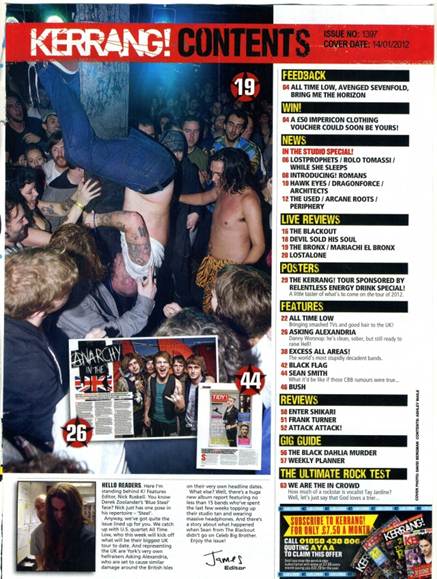
The main image of the contents page is composed with the four models' looking away from the camera, they look quite serious and are dressed all in black suggesting that the particular band come into the heavier metal genre, representing a genre of music that Kerrang’s readers are interested in. The expressions on the four models' faces connotes that they are serious about making music about their job. The main image is part of a competition advertisement which gives readers the opportunity to win tickets to see that particular band, Skunk Anansie, the font is wide and bold to catch the reader’s eye when they first turn the page to the contents page, therefore encouraging them to enter the competition. The list of articles in the magazine are placed in the conventional  far right with an image next to it, this highlights particular categories of stories in the issue in bold upper case yellow font to attract attention. Below, subtitles are in black font which is slightly smaller to highlight the features that come into a particular category in upper case font so it is clear and easy to read. The contents page also contains a conventional letter from the editor, which talks directly to the readers as it is aimed at a particular group of people. James, the editor talks informally to the audience, this makes it more personal and friendly. The letter is paired with an image of the editor and Hayley Williams, which links with the cover line on the front cover and the double page spread for Reading and Leeds festival since she appeared at this particular festival. The content page also contains an offer for the magazine subscription with the freebie of V05 hair gel which many of the target audience may use, encouraging more sales of the magazine and promotion of V05 hair gel.

The double page spread links with the main image on the front cover of the magazine at is a feature interviewing the three different band members about their experiences at Reading and Leeds festival. The headline of the double page spread ‘Reading  & Leeds 2012 belongs to us!’ shows how You Me At Six, Deaf Havana and The Blackout were big hits of the festival. However, this could also refer to the festival belonging to the people who went since the festival wouldn’t have been what it was if the people weren’t there either. The main image of the double page spread is positioned conventionally alongside the article as it links with the interview, this is because it shows the three people who were being interviewed together in a festival background, showing what they are going to be talking about in the feature and suggests that they may have been interviewed fresh off the Reading & Leeds stage, also linking back to the original headline. The text is arranged in the style of an article so the audience know how to read it, since it is nationally known that you read a newspaper from the first column to the column on the far end of the page. The pull quote ‘Right now, Britain has better bands than the Americans…’ highlights a particularly interesting point that was made, almost promoting the three bands interviewed as they are all British. This represents that a large percentage of Kerrang’s readers are British and appeals to them directly. It is in bold, black upper case font to draw attention to the quote in the aim of making the readers read the whole article to get to that particular part instead of just scanning through the article. 


Monday 15 October 2012

Different types of framing


Evaluation of Magazine Cover


Evaluation of College Magazine Cover
My final product demonstrates the basic conventions of a magazine well as it has a mast head, main image, headline, bar code and several cover lines. The cover lines aren’t positioned in the conventional left third but in the far right of the magazine, I decided to do this due to my research when I found an example of a magazine cover which did the same thing. I thought it was different and showed the unique quality of the magazine, perfect for showing the uniqueness of Wyke. The pattern in colour used for the cover lines make the cover more interesting and gives the magazine a sophisticated colour scheme. I chose the colour purple for the colour scheme of the magazine as it is supposed to be the ideal colour, it connotes good judgment and spiritual fulfilment, which gives the readers the impression that when they finish Wyke they will be fulfilled as they will have achieved good grades.  The main image follows the conventions of a normal magazine as they usually focus on one subject could link to an article in the magazine. The image is showing a girl stood in the Wyke building holding some books with a smile on her face, this denotes that she is happy to be at college and works hard. As she is looking at the camera it’s as if she is looking at the readers to show her success in college and how other students can be successful too. I chose to call the magazine the ‘Wyke Warbler’ as ‘Warbler’ sounds quite old fashioned and today old fashioned tends to be modern so I chose this name to appeal to the target audience of the 16-18 year olds that go to Wyke College.  When you say the name it sounds quite catchy due to the alliteration in the name, making students more likely to pick it up and read the magazine. On the cover I used a conventional bar code to show that the magazine is professional and it makes it look even more like an actual magazine.

My media product represents the typical students that go to Wyke by the image on the cover, the girl looks like a normal college student, she is dressed casually and holding some books which puts her into the stereotype of a student. She is surrounded by other people that go to the college showing the environment that students are in every day and they don’t look all the same, they all dress differently and have their own styles which show how teenagers are viewed by other people. All the students including the model look like they are in all one particular age group which represents how old you have to be to go Wyke. However, if I were to do my product again, I may take a picture of a model outside one of the Wyke buildings to reinforce that it is actually the Wyke college magazine.

I appealed to my target audience by including topics on the cover lines which may interest them or maybe something that they may need help with, or may be particularly worried about. For example, ‘Check out the perks of NUS’ draws the audience in as the students will get the idea by reading this cover line that they may get free gifts, save money and other freebies by buying an NUS card. ‘Upcoming college parties’ also appeals to the target audience as many students think parties are a part of college life and if they have the chance to go to a party most students are likely to be very interested. The font of the mast head, cover lines and main headline is modern and eye catching, students don’t want to be reading something which may come across as old fashioned so the text makes it more likely that they are going to pick the magazine up and read it.

When producing my product I developed my skills in Photoshop even more, I used different blending options on the text and I’m now more aware of the fonts that you can use. To put a bar code on the cover I had to take one from Google Images, when transferring this into Photoshop I had the problem that the white background was still there and this looked odd against my main image. To overcome this problem I learnt how to use the magic wand tool which quickly selected all the white parts of the bar code so I was then able to delete them from the image. Some parts of the white were still left over so I learnt how to use the background eraser too which got rid of the white parts and replaced it with the background underneath.  I also managed to adjust the brightness of the image which made the text stand out more and made it so the image didn’t look as dark. I am more confident using the spot healing tool which allowed me to erase any blemishes on the models face therefore making the image look more professional.  

Final front cover


Mock up of Contents Page


Initial Ideas


Tuesday 9 October 2012

Grid of conventions for my Magazine


LIIAR Analysis of Kerrang Magazine

Language

•     The photograph is covering the mast head of the magazine which shows that the magazine has been around for a while and is an established brand. They expect the audience to know the full name of the magazine by only seeing a part of it. The style of font represents the type of music that Kerrang promotes and connotes the loud, rock ideology that the magazine is all about. The font looks as if it has been broken or smashed, giving the idea it is supposed to have been smashed by a guitar or by some music playing too loud. The colour of the mast head is black which is a common colour associated with rock music and how people dress who listen to that particular genre of music. The photograph is composed to show all three band members of 30 Seconds to Mars, by looking at it you can assume what music means to them. The lead singer, Jared Leto, has his hand over his heart and is looking directly at the audience, this could mean that music is a part of him, is close to his heart and could also connote that his fans mean a lot to him. The cover lines aren't positioned in the conventional left third, instead they are in the far right of the cover of the magazine. They are accompanied with images which make the magazine more appealing to the audience as there isn't too much text, therefore making it more exciting and fitting for the target audience. The main cover line links with the main image which is positioned underneath it as it advertises what is most likely to be featured in one of the magazine’s double page spreads. It is big and bold which draws the audience in, making readers want to know more about 30 Seconds to Mars. ‘The Making Of A Modern Masterpiece’ positioned underneath the main cover line sounds exciting and makes the reader want to know what the ‘Masterpiece’ is and what it is all about.
Institution
         The publishers of Kerrang magazine are the Bauer Media Group. The other magazine that Bauer publish is Q, which is also devoted to alternative music and accounting for people with different music tastes. Its head quarters are in Hamburg, operating in 15 countries worldwide. Worldwide circulation of Bauer Media Group’s magazine titles results in about 38 million titles a week. Since the company was founded in 1875, it has been privately owned and under management by the Bauer family. The company was formerly named Heinrich Bauer Verlag KG, abbreviated to HBV and usually shortened to H. Bauer. Bauer Media Group has been managed by four generations of the Bauer family. It started out as a small printing house which has grown into a worldwide publishing and media company. Bauer started in the UK with the launch of Bella magazine in 1987.
Source: www.wikipedia.com

Ideology
Kerrang magazine’s slogan is ‘Life is Loud’, this represents the genre of music that the magazine is devoted to and what it is all about. Its slogan conveys the idea that you can’t live without rock music and that rock music represents the things you go through in life. It gives the idea that you shouldn’t care about what people think of you and make as much noise as you want to, preferably through music as that is what the magazine is trying to promote. Kerrang’s ideology is to oppose the mainstream side of music and encourages people to be more unique and broaden their taste in music. This is shown in the front cover by the colour scheme, images and mast head. The sort of colour scheme shown wouldn’t usually be seen in a popular mainstream music magazine so it’s going against a majority of people’s ideas of music. The band, 30 Seconds to Mars don’t look like a conventional pop group, they promote the idea of being different and unique.

Audience and Representation
The magazine appeals to the target audience as the models shown in the image are looking directly at the camera, which seems as if they are looking directly at the audience. This portrays the idea as if they are reaching out to their audience and want to personally connect with them. 30 seconds to Mars fit into the genre of music which Kerrang is devoted to and what the majority of the magazine’s readers will listen to, therefore this caters for the target audience’s needs as Kerrang is advertising bands that fit into the rock music genre. One of the cover lines is showing You Me At Six and is partnered with the phrase ‘Josh’s guide to love and sex’. The magazine is targeted at young men and women, a lot of people have a lot to say about this topic, so this cover line being shown allows the audience to relate to the celebrity and gives the audience some reading that would interest them. 30 Seconds to Mars represents Kerrang as they are passionate and care a lot about music. This is reinforced by Jared Leto being pictured with his hand over his heart. The band look like a conventional rock band as they are wearing casual clothes, they are looking relaxed and laid back. 


Conventions Analysis


Research for College Magazine


College Magazine Survey
  1. Would you like to hear about local news in the magazine?
  2.  Do you want to hear about college sport’s teams’ progress?
  3. Would you like to hear about local events happening in the near future?
  4.  Do you want to know about college trips available for you?
  5. What times of magazines do you purchase and why?
  6.  Would you prefer to have a magazine mainly about college or to be a bit of everything
Findings
My research showed that my audience wanted a magazine that wouldn’t just be about college but other things as well. When I carried out the survey, it showed that my audience not only wanted to hear about local news, but local events which are happening in the near future as well. For example, this could be upcoming music gigs. Results showed that the target audience would not like to hear about the college sports team’s progress, this could mean that there would be a small feature about sport just for the people who take part or who are P.E students. Another popular demand was to be informed about available college trips in the future and any details that students would need to know about them.

I like how the main image covers up the mast head which makes the readers presume that it’s Kerrang. The cover lines on the far right shows what’s in the magazine in an order and the audience will immediately look to that part of the cover to see what is featured in the issue. It is not jam packed with text and images which makes it more eye catching and easy to look at. I may use these elements on my college magazine. 


For the main image I may take a picture of a student smiling with text books etc to show that the student is happy to be at Wyke. From this cover you can gather that there is going to be a double page spread about the woman shown, so I may include an interview with a student who has just left college giving any tips for first year students.


On this magazine, I like how the main image covers up the mast head like it does on Kerrang as it must be well established and well known. It presumes that the audience will know what magazine it is by seeing only a part of the mast head. I may use this element for my college magazine as people should know it’s the magazine for Wyke. I also like the position of the main headline as it is drawing the audience’s attention in.


On this example of a college magazine, I like the use of the left third where all the main features of the magazine are listed designed to draw the audience in. They appeal to what college students want the most, therefore it will bring in more readers.The main cover lines are in upper case which makes it easy for the reader to read and draws attention to the elements which are describing the main features in the magazine.


The Magazine is going to include
  • ·         Details about college trips available
  • ·         NUS discounts
  • ·         Info about college parties
  • ·         Info about upcoming local events (music gigs, festivals etc.)
  • ·         Ideas on how to be organised
  • ·         Double page spread about local news 
<!--[if !supportLists]-->