Friday 22 March 2013

Looking back at your preliminary task, what do you feel you have learnt in progression from it to the full product?

Final music magazine front cover.
College magazine front cover.
From looking at my preliminary task compared with my final front cover, I can clearly see the improvement I have made to my skills since the beginning of the course. Compared with my preliminary task my final front cover looks more like a professional magazine due to my increasing understanding of  conventions of a magazine product.
Throughout my coursework I have learnt and gained an understanding of the conventions of a music magazine. This has helped me to produce a media product which looks and is recognisably a magazine due to the use of simple conventions such as the main image, mast head, headline and cover lines. Therefore, this has helped me create a media product which looks professional and unique because it is not the same as any other existing magazines.
I have learnt how to properly use tools that I was already aware of on Photoshop and gained knowledge of tools and functions which I didn't know were available. These new and improved skills on Photoshop have helped me create a media product which matches the conventions of a magazine successfully. The image on the front cover of the college magazine is cluttered and not well composed. Whereas, with the main image on my final media product it is clear, in focus and is clearly a mid shot (which is the more common type of shot seen on the front cover of existing magazines).  The cover lines and headline on my final media product are clear and easy to read, whereas the cover lines and headline on my preliminary task don’t stand out and are lost within the image. I think this is down to my initial choice of colour scheme as the colours were not opaque enough to stand out from the page.
If I was able to change my final product,  I may try to increase the presence of the heavier-rock genre as it is pretty stuck on the indie-rock genre. However, this can be seen as a good thing since it will devote more attention to artists of this genre. Therefore, more people who are interested in that type of music will read the magazine. I would also include more pictures on the contents page of other acts to show the variety of rock music so the product caters for a wider spectrum of readers.
It was useful carrying out a preliminary task as it helped me understand what skills and techniques I would need to learn in order to produce my own music magazine. It increased my awareness of what types of shots, layout and articles feature in a magazine which create interest for the target audiences and in turn would lead to the creation of a successful media product. 


What have you learnt about technologies from the process of constructing this product?


•       When I first started using Photoshop, I had little knowledge of its tools and functions, I didn’t know how to use the programme to make a professional media product. From taking part in this task I have learnt a lot about how to use the different tools in Photoshop in order to create my magazine.
•        For example, for the double page spread,  I used tools such as the quick selection tool to cut the outline of the model out of the image’s original background to place onto a new image.
•        I used the blur and smudge tool to smooth out the edges of the cut-out object so I could blend the image into the background.
•        If there were parts of an image that I had taken that I didn’t want (objects in the background), I used the crop tool to cut the picture down so these objects wouldn’t interfere with the subject of the image. To reduce the size of images and other shape objects (cover lines, headlines, page numbers, squares)  I used the transform tool.
•        I used the spot healing tool to eliminate any blemishes or any shiny surfaces on my original images which I used for my media product.
•        For some shape objects that I used as a background for some text, I reduced the opacity of it so the text in front of it would stand out from the page more. I also did this so the text wouldn’t be lost within the box that it was in front of.
•        I used the text tool to select from the various fonts that Photoshop comes with. This allowed me to choose a font style for the small text (list of contents and the article etc.) and the larger text (headline on the front cover, title of the double page spread etc.)


This is how I created a new document. I selected the A4 size since this is the common size of a standard magazine.

Cropping the image.

Using the spot healing tool.

Using the quick selection tool. 

Using the blur tool

How did you attract/address your audience?


•       The results of my questionnaire showed that the target audience thought the specific genre (indie-rock) was reflected successfully, through the use of mise-en-scene within the imagery, colour scheme, the overall house style and layout. My target audience also thought that the product addressed modern stereotypes and events such as Leeds Festival. The chosen colour scheme of red, black and white was very popular as they thought that it contributed to the genre perfectly. Another comment was that ‘it made the text and pictures stand out from the page’, therefore making it easy and clear to read.
•       When asked the question, ‘What part of the magazine appeals to you specifically?’, the most popular answers were the double page spread article as well as the headline and cover lines shown on the front page of the magazine.
•        The majority of my target audience said that they liked the overall layout of the media product which looked very ‘interesting’. Another comment was that it is ‘clearly letting the reader know what the magazine is about’. One person was drawn in particularly by the fact that the Leeds festival line up was featured within the magazine.
•        Overall, the majority of my target audience said that they would buy the magazine on a fortnightly basis at the price of £2.50. However, one person said they would prefer a monthly magazine. Due to this response, I may consider doing a monthly magazine rather than a fortnightly magazine, but at a slightly more expensive price if I was to do this task again.
•        Furthermore, when asked ‘Does the magazine make you feel like ‘‘part of the scene?’’ every person answered yes. One person said this was because ‘it offers a large amount of information and looks professional’, whereas another person said this was down to the choice of imagery and articles. 

Who would be the audience for your media product?


•        The audience for my media product would be males and females from the age 15-24 which is the same target audience for Kerrang magazine. However, the majority of Kerrang’s readers are male so I have tried to appeal to female readers as well when producing my own media product. I chose this age group because when carrying out my initial research, I discovered that people of this age have a great interest and passion for music.
•        By looking at a reader profile for a typical reader of Kerrang, I discovered that Kerrang’s audience are very much driven around rock music. It has many influences on their lives. It influences their socialisation with friends, their choice of leisure time activities and lifestyle. Their readers are also devoted to attending gigs and other music related events. Therefore, I created my own reader profile around Kerrang’s reader profile. I want to target the typical reader who loves music and is heavily influenced by it.
•        I have tried to aim my magazine at the same type of person who reads Kerrang. I think that my media product appeals to a broad spectrum of readers who like different types of alternative music. One of Kerrang’s ideologies is rejoicing in individuality so I have tried to represent this idea through my media product.
•        I carried out audience research by holding my own focus group. By doing this it helped me understand my target audience’s needs which therefore helped me produce my media product.  I made my media product an affordable price of £2.50 as one of my major findings from the focus group was that people will only buy the magazine if it is an affordable price. My target audience prefer it if the magazine is not so focused around making money and would prefer it if the magazine came across as if it was passionate about music. My target audience are also interested in news features which would talk about reviewing new music and upcoming festivals and concerts. Overall, my target audience want a magazine which will not bore them and will talk broadly about their love for music. 

What kind of media institution might distribute your media product and why?


•A media institution is an establishment that is in charge of producing, distributing and marketing different media products.
•For my initial research I looked into Kerrang magazine, which represents the genre (alternative rock) that I was attempting to recreate in my own magazine. However, Kerrang do represent the heavier genre of rock music more so than my own magazine does. The publishers of Kerrang magazine are Bauer Media Group. They also distribute magazines which cater for niche audiences. For example, Q Magazine, Heat and Closer.  I think that the genre of my magazine is a mix of Kerrang and Q magazine. Therefore, my magazine will cater for a new niche audience.
•Bauer Media Group operates in 15 countries internationally, and circulates 38 million magazine titles per week. 
I would want Bauer Media Group to distribute my magazine because they distribute Kerrang magazine, which is what I focused my initial research on. Due to the fact that they operate worldwide in 15 different countries, this means that the funds required would be available to allow the magazine to reach local audiences and foreign audiences.
•Due to their big budget, Bauer would be able to contribute more funds towards: attracting big artists to be featured in my magazine, prizes for competitions, organising events and other music related events.
•Bauer’s magazines also have their own website, radio station and television channel. Therefore, my magazine could have all of these extras which will address more possible consumers. 


How does your media product represent social groups?


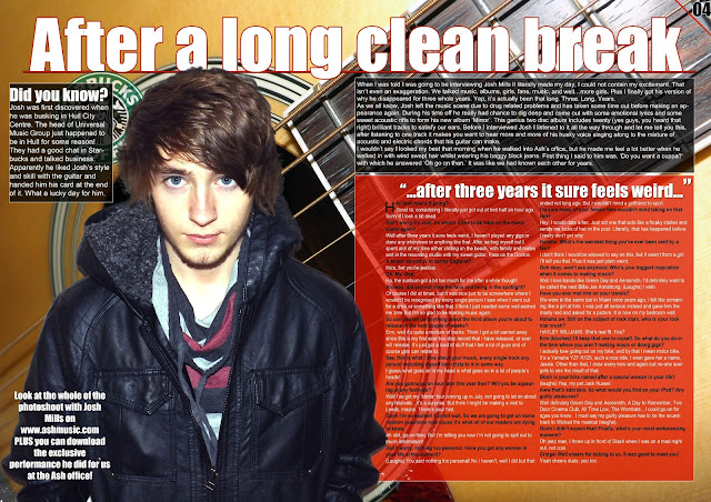
•      The main image shows a fairly young man who is in his late teens/early twenties, he is dressed in black clothing and a hoodie with his hood up, which is what many people would expect of a typical teenager. He has a positive facial expression which breaks the teenage stereotype slightly as many people expect people who fall into this category to be fairly antisocial. His dark haircut can be compared to the stereotypical ‘emo’ hair cut since the fringe is covering part of his face. In the other images the models are dressing in dominantly black clothing, but with slight grins on their faces, or they are posing for the camera which shows that they are still fairly young. One model is wearing a Green Day t-shirt which represents the social group of younger people who love rock music, as the majority of the time it is only younger people that wear band merchandise. In particular, younger people wear band merchandise in order to feel like they are part of a group. Therefore, this makes readers alike feel as if they are ‘part of the scene’. The font selection for the cover lines, mast head, and article writing is modern and clear in order to appeal to the younger generation. Due to this, you can tell that the magazine isn’t aimed at the older age group, as usually in that instance, the font would be more formal.
       The Facebook and Twitter logos which are shown represent the age group I am trying to target as they are the more common users of this website, it also indicates that the magazine is not supposed to represent middle-aged adults as the majority of them don’t tend to use social media sites as frequently as people in their teens and early twenties do.
•      The article for the double page spread is an interview which is in a colloquial and informal style which I have stated previously. For example, the interviewer begins the interview with ‘Hey man, how’s it going?’ and the interviewee responds with ‘Good ta’ as opposed to answering with ‘I’m good thank you.’ This reflects the way that young adults speak to each other, because you can assume  that the interviewer, who is also the editor,  is probably fairly young also. This is shown by the picture on the contents page which matches with the editorial. 

In what ways does your media product use, develop or challenge forms and conventions of real media products?


Thursday 14 March 2013

Double page spread draft 3 (more refinements)


After receiving feedback from my tutor, I have made further refinements to the double page spread for a final draft. I have added more images of the artist to further compliment the main image. I have positioned them at an angle to create the illusion of them being physical photographs and to show that the artist had a photo shoot. I have also reduced the size of the 'Did you know?' box and moved the Starbucks logo behind it. As the columns seemed to be too wide on my previous drafts I reduced the width of them and have added another column to make it look more like a magazine article. As the page was missing a byline, I added this feature and positioned it above the introduction of the article. I have made it the same font as the title of the article as the style of font is clear, bold and easy to read and it creates a house style throughout the magazine.  Furthermore, I have moved the text which was originally on the bottom right of the page, which was referring to the photo shoot, to become a conclusion of the article. I have done this because originally this text looked out of place in its original position. Overall, I am happy with this draft as a final draft, as it includes all the conventions of a double page spread, it has an attractive and interesting layout and it portrays the ideologies and musical genre of my magazine.

Monday 11 March 2013

Double page spread second draft


For the second draft of my double page spread I have made some refinements to my previous draft. I took a selection of images of an acoustic guitar and found that an extreme close up shot of the guitar works better than my previous shot of a brick background. It also reflects the genre of music that the magazine is trying to promote more so than the brick background as an acoustic guitar is one object which you would associate with alternative music. I have added a red stroke to the title of the article to make the text stand out from the page which is also fitting with the general colour scheme. I have also switched the colour of the shapes surrounding the introduction to the article and the actual article. I have done this because the article is the dominant feature of the right hand side of the page, the red background makes this part of the page more appealing and interesting.

Contents Page Final Draft


After receiving feedback from my tutor, I have altered the layout of my contents page and reduced the amount of images that it includes. Instead, I have added an image of the artist who is featured on the front cover and double page spread of my magazine in order to create continuity. This extra image shows that the artist is an important feature of the magazine and indicates that he is going to be the feature of the double page spread. Both of the images now have page numbers, to assist the reader in locating the article, instead of being listed in the overall contents as there is no need for it to be shown twice on the contents page. To reinforce the genre of music of the magazine I have added the image of an electric guitar to show that the magazine focuses on alternative music. As well as the added image of the guitar, I have added the date the magazine was issued along with the website as the previous draft was missing this feature. To attract more interest by my audience I have added a competition advertisement to make the reader want to turn the page and find out how to win the signed picture. The new black background to the contents list and editorial makes the text stand out from the page more, the text is now not lost within the page. Overall, I am happy with this as a final draft for my contents page as it shows clearly the conventions of a contents page and is much better than my previous two drafts. This is because it reflects the musical genre more so than my previous drafts. Furthermore, with the added features and objects I think it will trigger more interest by my target audience.

Tuesday 5 March 2013

Double page spread - feedback

After receiving feedback from my tutor about my double page spread, a few areas have cropped up of which I need to add or work on:


  • Columns appear to be a little wide.
  • No suggestion of genre from the main image.
  • No other images included. 
  • No explicit references to musical genre.
  • No reminder of the name of the magazine.

Monday 4 March 2013

Double Page Spread 1


I like this first draft of my double page spread because it has a clear image which is the dominant feature of the left side of the page. Here, the model is pictured without his hair covering his face, whereas on the image for the front cover he had some hair covering his face, which implies that he is being more open and not hiding anything anymore. The layout is interesting and the white colour of the title draws attention to the title making the reader want to carry on and read more. However, for my second draft I could make some refinements to the page by adding another column of text and making the columns narrower, as at the moment they look too wide for a standard magazine article. I am not to sure about the background of the image as I don't know whether it matches the article entirely. Therefore, for my next draft I will use an image that reflects the genre of music that the artist should be associated with.