Monday, 11 March 2013
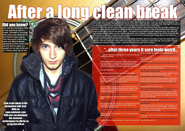
Double page spread second draft
For the second draft of my double page spread I have made some refinements to my previous draft. I took a selection of images of an acoustic guitar and found that an extreme close up shot of the guitar works better than my previous shot of a brick background. It also reflects the genre of music that the magazine is trying to promote more so than the brick background as an acoustic guitar is one object which you would associate with alternative music. I have added a red stroke to the title of the article to make the text stand out from the page which is also fitting with the general colour scheme. I have also switched the colour of the shapes surrounding the introduction to the article and the actual article. I have done this because the article is the dominant feature of the right hand side of the page, the red background makes this part of the page more appealing and interesting.
Subscribe to:
Post Comments (Atom)

No comments:
Post a Comment